I collaborated with Ken Nakajima for this speculative prodution of Monteverdi’s L’Orfeo. For the timeframe we had, we were advised to work in pairs of set & costume to realistically manage the workload. I have done the costume design, Ken has done the lighting design, and we co-designed the set. The collaboration was vital to the success of this design because our challenge was to create an entire conceptual world without a director.
![]()
![]()
![]() In regards to textures, a significant location in Hades is the River Styx. We knew we did not want to attempt using water on stage, so we researched how to create the illustion of water. We discussed reflective materials and also projecting textures onto the columns.
In regards to textures, a significant location in Hades is the River Styx. We knew we did not want to attempt using water on stage, so we researched how to create the illustion of water. We discussed reflective materials and also projecting textures onto the columns.![]()
![]()
This is our color scheme along the plot line depicting the descents and ascents. The black & white points in the middle are inspired by the above images of descending. And final hue of pink is inspired by the cloudy sunsets in the above photos of The Temple of Apollo. In the research, we began by looking at opera productions to get a sense of the scale we were working for, The Weiner Staatsoper (Vienna State Opera). These were the most striking ones because I was inspired by how they create an expansive space while still filling it. Our venue was very intimidating because it was much larger than I am used to so I had no idea where to even start. These productions gave us a reference for how to play with the depth and height of the space, and how to use lighting/color to fill the scenes.
After listening to the opera and reading the Liberetto, there was a clear juxtaposition in the narrative: descent vs ascent.Some of our influential points of research were looking at creating forms with light, contrast, and shadow that represent the descent into hell through narrowing shapes. On the other hand, we also came across the ruins of the Temple of Apollo (Apollo being a significant character in the last act ascending with Orfeo). We also looked at classic art/sculpture depicting Orfeo’s ascencion.![]()
The Temple of Apollo inspired us for the architecture of our set. In the first two acts of the opera, they sing about going to the temple for Orfeo & Euridice’s wedding. So, we were interested in the idea of eluding to the Temple of Apollo in the layout of the set. However we were not interested in creating a naturalistic temple, but a more minimal outline of it. I researched columns & brutalist architecture. From the images, the height and shadows was a focus.
While these became a reference for the Temple in Thrace (the setting of the first two and last acts). We really wanted to have a striking contrast for the 3rd & 4th Acts set in Hades (Hell). This led us into texture & material research to show gradual deconstruction as the narrative descends into hell. It became a critical point in the references to show the set change from Thrace to Hades which we wanted to tackle by exploring texture & forms shifting.
![]()
To expand on the idea of showing the gradual descent, we explored how to do this with color. Ken was doing the lighting design, so this was driven by his ideas. Unlike common depictions of hell as being an inferno, we did not get that atmosphere from the opera. We felt more warmth in Thrace vs cold desolation in Hades. I created a moodboard of some visuals to inform a color scheme.
![]()
After listening to the opera and reading the Liberetto, there was a clear juxtaposition in the narrative: descent vs ascent.Some of our influential points of research were looking at creating forms with light, contrast, and shadow that represent the descent into hell through narrowing shapes. On the other hand, we also came across the ruins of the Temple of Apollo (Apollo being a significant character in the last act ascending with Orfeo). We also looked at classic art/sculpture depicting Orfeo’s ascencion.

The Temple of Apollo inspired us for the architecture of our set. In the first two acts of the opera, they sing about going to the temple for Orfeo & Euridice’s wedding. So, we were interested in the idea of eluding to the Temple of Apollo in the layout of the set. However we were not interested in creating a naturalistic temple, but a more minimal outline of it. I researched columns & brutalist architecture. From the images, the height and shadows was a focus.
While these became a reference for the Temple in Thrace (the setting of the first two and last acts). We really wanted to have a striking contrast for the 3rd & 4th Acts set in Hades (Hell). This led us into texture & material research to show gradual deconstruction as the narrative descends into hell. It became a critical point in the references to show the set change from Thrace to Hades which we wanted to tackle by exploring texture & forms shifting.

To expand on the idea of showing the gradual descent, we explored how to do this with color. Ken was doing the lighting design, so this was driven by his ideas. Unlike common depictions of hell as being an inferno, we did not get that atmosphere from the opera. We felt more warmth in Thrace vs cold desolation in Hades. I created a moodboard of some visuals to inform a color scheme.


 In regards to textures, a significant location in Hades is the River Styx. We knew we did not want to attempt using water on stage, so we researched how to create the illustion of water. We discussed reflective materials and also projecting textures onto the columns.
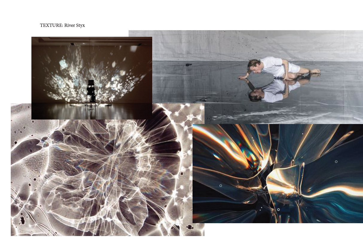


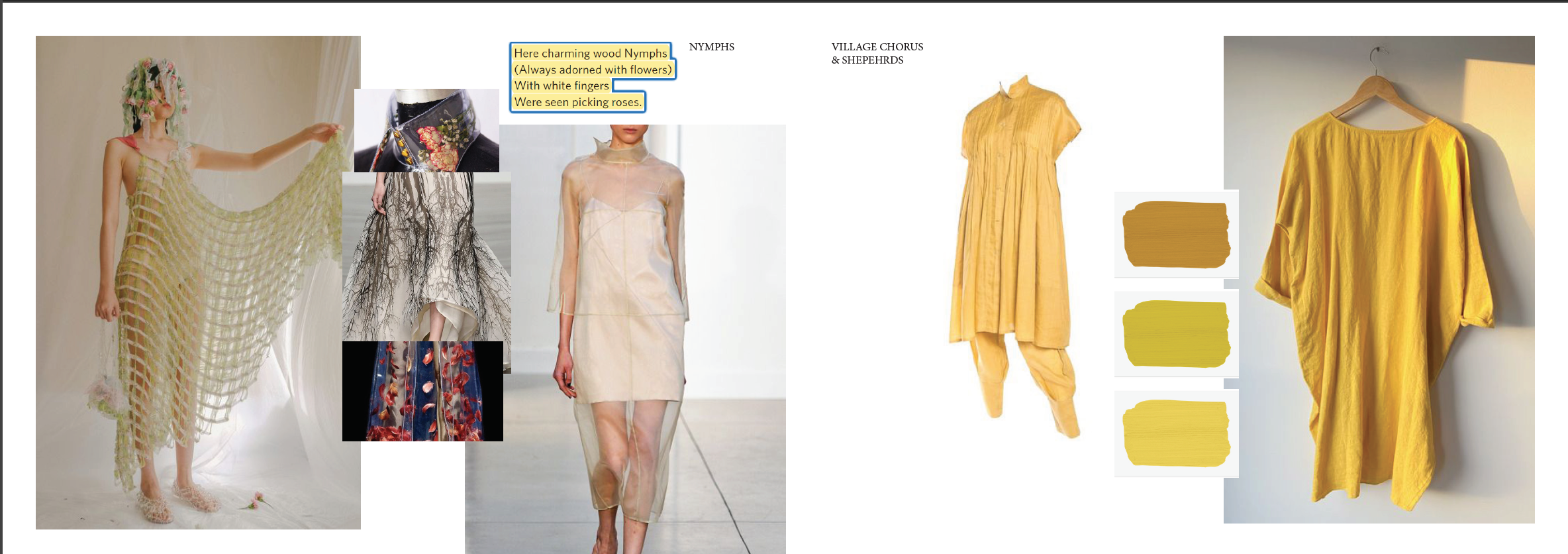
After establishing our set & color environment. I began to do visual research for the costumes. In a tutorial with Anna, she advised that if we were to drive the narrative with our saturated color scheme, it would also have to be enhanced by the costumes. Therefor, I decided to use the chorus as enhancements and saturating their costumes into the environment through color & material choices. ![]() These are my references for the chorus in Thrace made up of Nymphs and villagers. For the nymphs (who I decided would be the female dancer ensemble), I was directly inspired by a lyric that talked about them picking roses. Meanwhile, for the villagers I wanted to give them a simple silhouette so that the color would be the focus; I was inspired by Issey Miyaki’s tunic designs from the 1980s.
These are my references for the chorus in Thrace made up of Nymphs and villagers. For the nymphs (who I decided would be the female dancer ensemble), I was directly inspired by a lyric that talked about them picking roses. Meanwhile, for the villagers I wanted to give them a simple silhouette so that the color would be the focus; I was inspired by Issey Miyaki’s tunic designs from the 1980s.
![]()
On the other hand, for the infernal spirits chorus in Hades, I was more interested in texture and how light would react with the costumes. I was inspired by the color scheme and River Styx research from above to look at holographic & oil-slick looking fabrics, while maintinging simplicity in the silhouette.
One of the decisions made at this stage was how the chorus would be split. We had 30 male, 30 female, 10 dancers (5 female 5 male) as our parameters. However, Ken and I both felt that 70 people present on stage in Hades would be overwhelming and contradict our vision of desolation. Thus, we decided to cut it down to 20 (15 chorus and 5 male dancers) for these scenes. This was also from the perspective of costs, since I was looking at more expensive materials, I could not afford to dress all 70.
After establishing a clear vision for the chorus, I began designing the primary and secondary leads. I kept them in black & white to stand out against the vibrant saturated environments.
 These are my references for the chorus in Thrace made up of Nymphs and villagers. For the nymphs (who I decided would be the female dancer ensemble), I was directly inspired by a lyric that talked about them picking roses. Meanwhile, for the villagers I wanted to give them a simple silhouette so that the color would be the focus; I was inspired by Issey Miyaki’s tunic designs from the 1980s.
On the other hand, for the infernal spirits chorus in Hades, I was more interested in texture and how light would react with the costumes. I was inspired by the color scheme and River Styx research from above to look at holographic & oil-slick looking fabrics, while maintinging simplicity in the silhouette.
One of the decisions made at this stage was how the chorus would be split. We had 30 male, 30 female, 10 dancers (5 female 5 male) as our parameters. However, Ken and I both felt that 70 people present on stage in Hades would be overwhelming and contradict our vision of desolation. Thus, we decided to cut it down to 20 (15 chorus and 5 male dancers) for these scenes. This was also from the perspective of costs, since I was looking at more expensive materials, I could not afford to dress all 70.
After establishing a clear vision for the chorus, I began designing the primary and secondary leads. I kept them in black & white to stand out against the vibrant saturated environments.

For Euridice and Orfeo, I was inspired by Ann Demeulemeester ombré dyed silk garments. My point of view here was to give a nod to their tainted fate from the start. The myth of Orfeo is well known, and an audience member is likely going to be aware of it from the moment they buy their ticket.
![]()

On the other hand, we have the second couple in the narrative: Pluto and Prosperina. I was inspired by Alexander Wang’s textured garments as a way of immersing the characters into the world of hell. As seen above we were looking at deconstructed concrete textures so I wanted these characters to feel like they were cut out of those stones too, especially Hades. But to also nod to Prosperina’s sympathy and connection to Thrace, softening her look a bit.
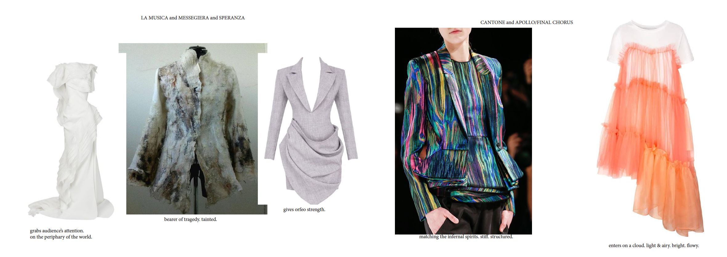
Lastly, the secondary leads act as a way to fill in the levels in the narrative. For example, La Musica who is our narrrator in the prologue is inspired by appearing like a greek scultpture to ground our narrative. Then, La Messegiera is the barer of tragedy so I wanted her to look decayed within the warm lively world of Thrace. Then, Speranza (Hope) is very much inspired by the strengh in her namesake as she leads Orfeo to find his fallen wife. Caronte is the boatman so I wanted him to also blend into the textures of the River. Apollo is our finale, so I was inspired by the lyrics saying he descends to earth on a cloud.
Lastly, the secondary leads act as a way to fill in the levels in the narrative. For example, La Musica who is our narrrator in the prologue is inspired by appearing like a greek scultpture to ground our narrative. Then, La Messegiera is the barer of tragedy so I wanted her to look decayed within the warm lively world of Thrace. Then, Speranza (Hope) is very much inspired by the strengh in her namesake as she leads Orfeo to find his fallen wife. Caronte is the boatman so I wanted him to also blend into the textures of the River. Apollo is our finale, so I was inspired by the lyrics saying he descends to earth on a cloud.
NEXT: PROCESS ︎︎︎
© Jida Akil 2026